We inherit the designs of our time. For most designers in the here and now, we are, whether we claim to be conscious of it or not, complicit in propagating the designs of our time.
These designs are a mix of the styles consisting of contemporary tech companies (Airbnb, Apple, Slack, Invision), of popular frontend frameworks (Material UI, Bootstrap, iOS) and of UI trends (as seen on Behance or Dribbble).
I have an alternative that I have come to like (this website follows the approach), which is to design by subtraction. Nested in our day-to-day design decisions are a lot of blind assumptions and prescribed rules. You could challenge these assumptions or rules. For example, “Why do I have a hero images on all my home page first folds?”, “Why must I convey depth with layers or box-shadows?”, “Why must buttons be the primary cta colour?” and so on. These challenges to the default open up opportunities to subtract and simplify.
Here are some websites/products that do it well:
Comma.ai

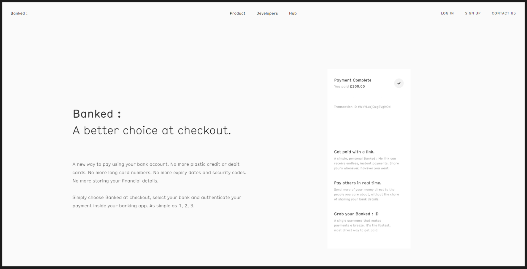
Banked.com
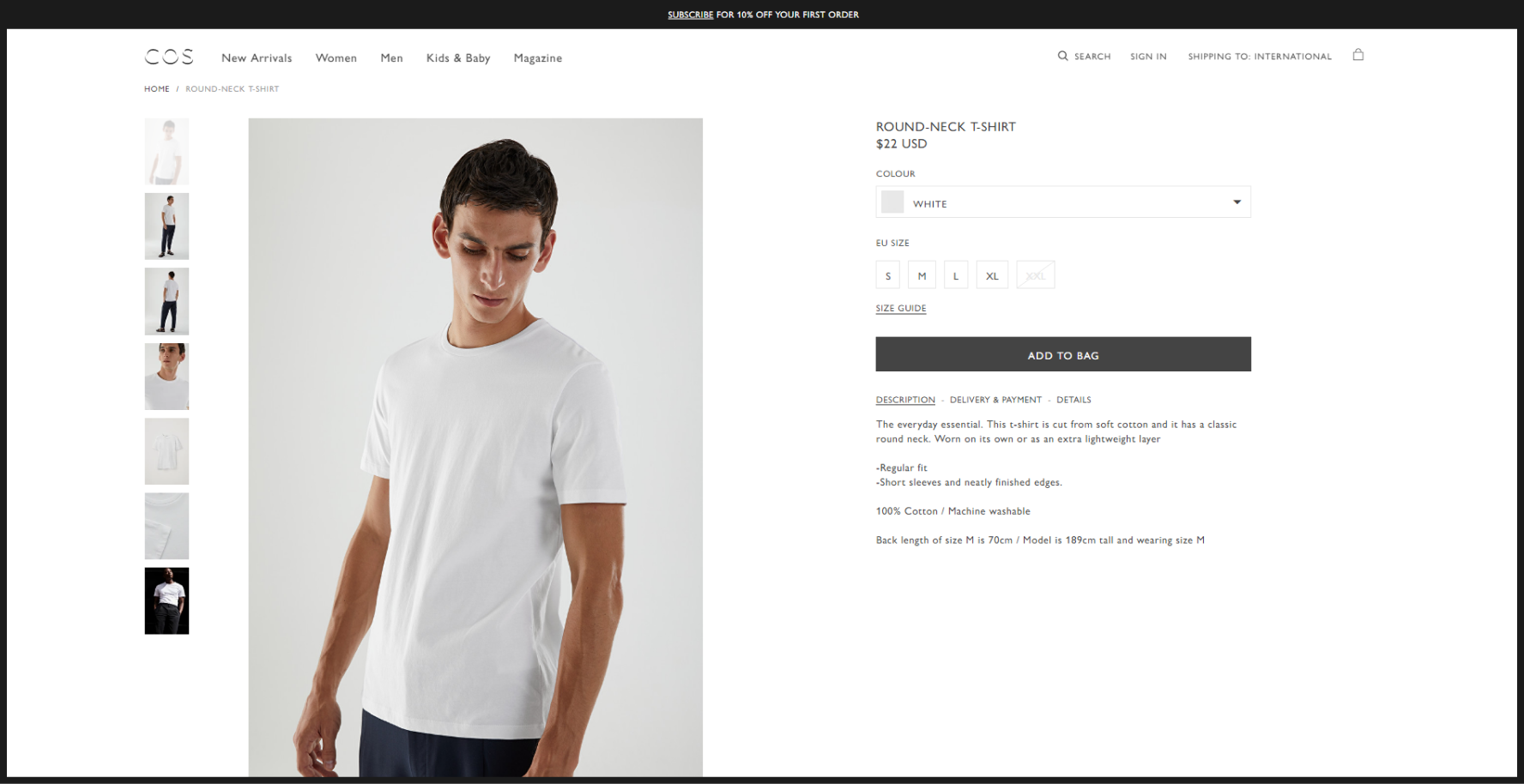
COS
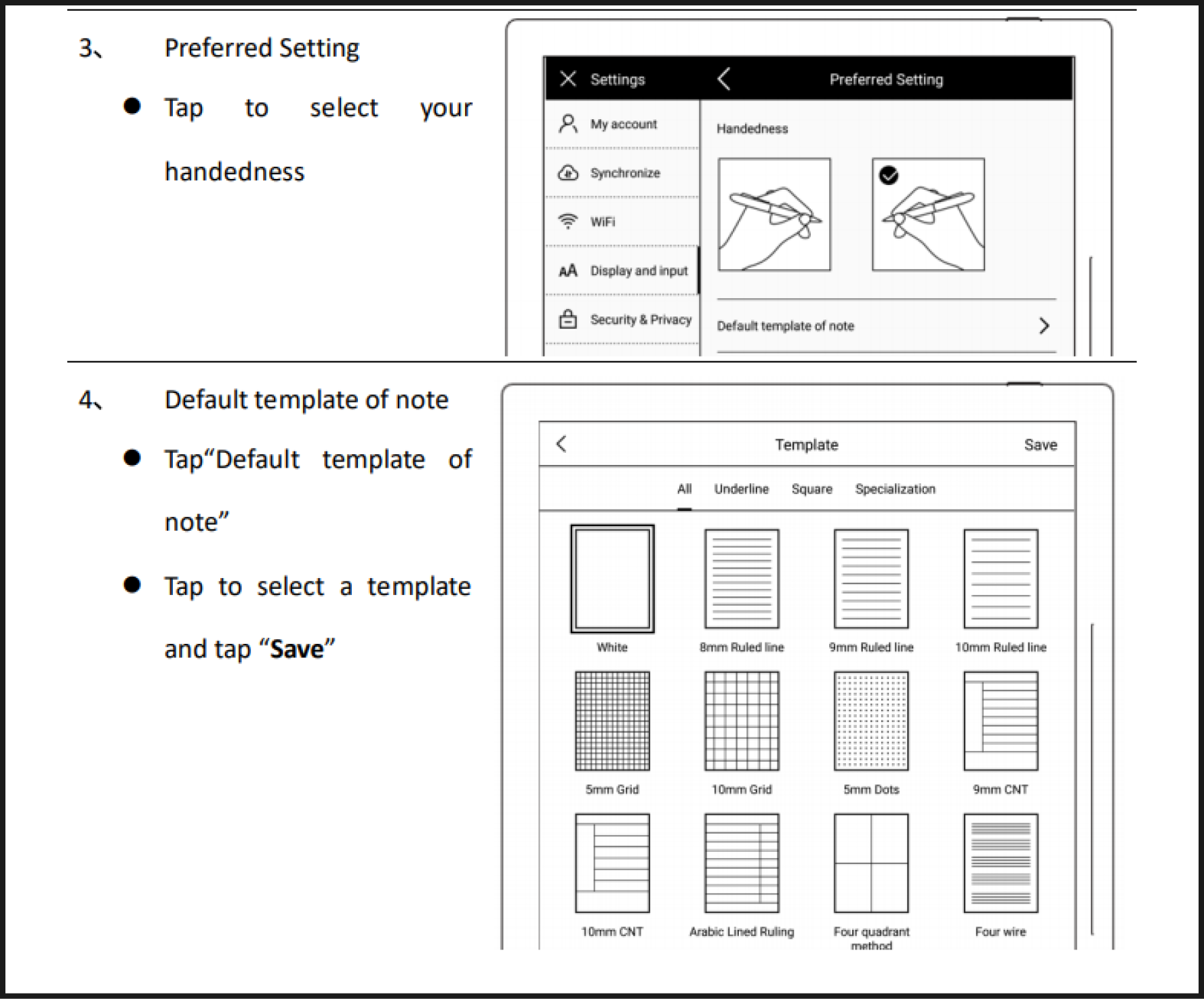
Supernote A6X UI